|
|
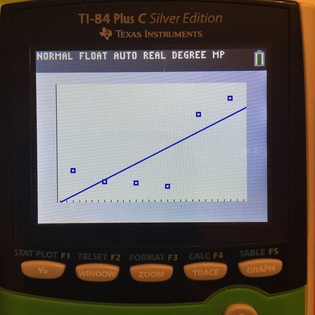
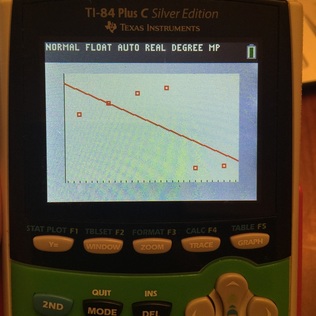
Scatter Plot in blue is United Arab Emirates "Public Debt" Scatter Pot in red is the United States "Public Debt" from
from 2010 thru 2015. The correlation is a very weak 2010 thru 2015. The correlation is very weak making the line
making the line of best fit not very accurate. of best inaccurate in predicting future percentages.
Equation of line of best fit: y = 6.6114x -13277.2667 Equation of line of best fit: y = -4.8457x + 9843.0333
Future predictions.... Future predications.............
2020 about 77.7% & 2030 about 143.8% 2020 about -19631.3% & 2030 about -19679.8%
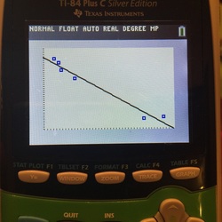
Comparing the "Public Debt" separately is very difference. However, if we compare the United Arab
Emirates and United State by seeing if there is a correlation and there is very strong correlation! Each data
point represents the year and the ordered pair is (United Arab, United States).
Equation of line of best fit: y = -0.8262x + 114.3622
